REBRANDING
We change to be even more ourselves.
A new identity for Comelit.
“It may seem like a cliché, but as time goes by, it teaches us to be introspective and treasure the new awareness that emerges. This is the process that has allowed us to reach the certainty that the current visual identity, whose highest expression is the new logo, no longer represents the true values of Comelit: a solid, reliable, and close-to-its-customers, suppliers, and collaborators company. The first result of this journey was the new claim, ‘With You Always,’ which fully reflects our attitude but does not mark a real before and after in the history of Comelit.
So, what’s the next step? We felt the need for an action that represents and certifies a real change, not because we thought that what was there before was old or ugly but simply no longer suitable for what we represent today.
The new logo, the main communicator of the visual identity, represents all the values that belong to us and make us unique and competitive in the market. A strategic choice that is not based on a mere graphic and aesthetic issue but aims to promote the identification of Comelit as a robust, trusted, and people-focused company.”
Edoardo Barzasi, CEO of Comelit
What is a Brand?
Solid, reliable and close to their customers.
Solid, reliable and close to their customers.
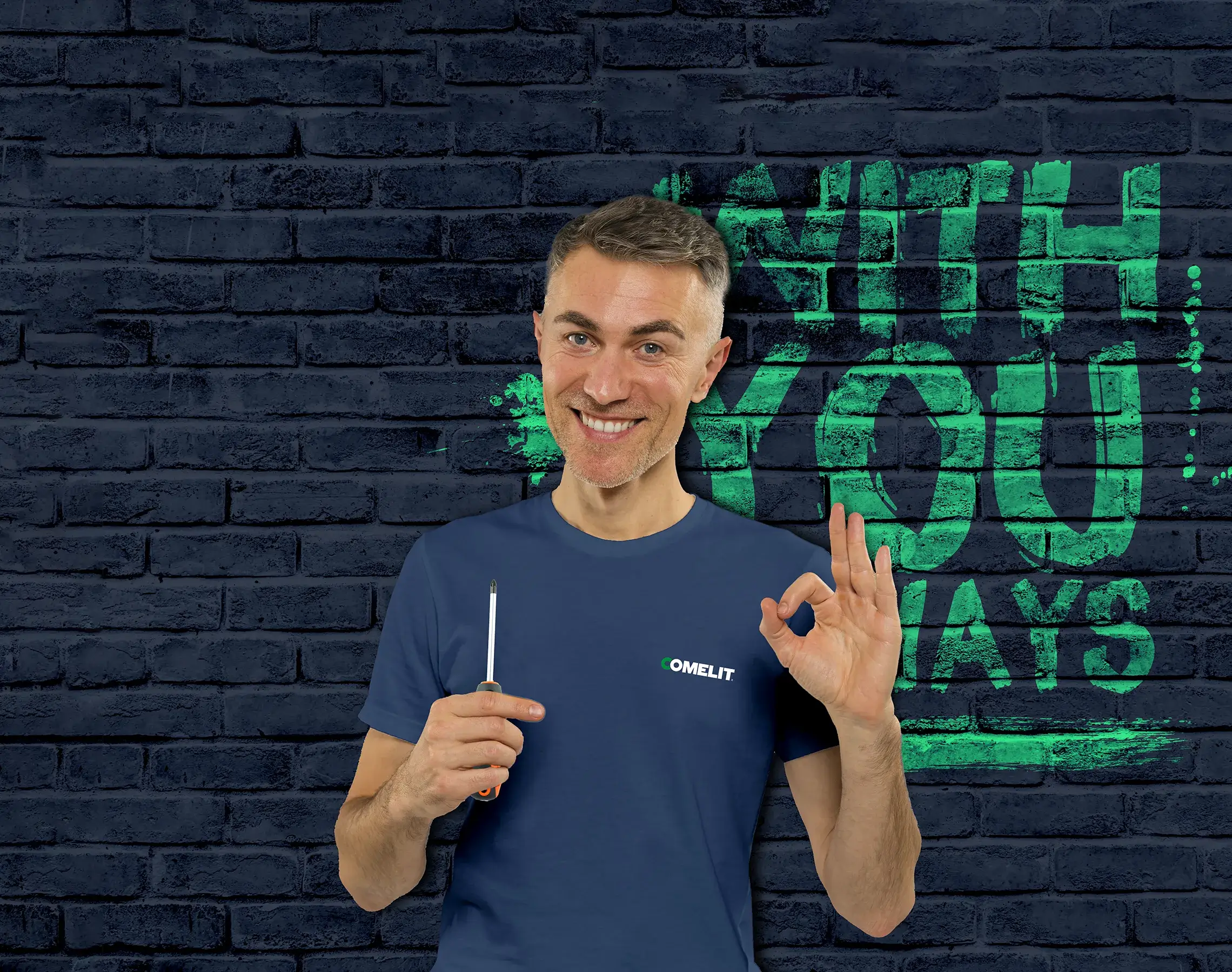
For this reason, we realized that the current visual identity could no longer represent Comelit’s real values, and therefore we decided to change it through a new claim and logo, which, before being a graphic sign, is an identity element that expresses Comelit’s essence and how we want to be perceived: solid, reliable, and close to our customers. In particular, a distinctive element of our personality is certainly our willingness and ability to stand by people (be they customers, employees, suppliers, and distributors) at all times that matter and always put them at the center of our attention! In practical terms, this means proposing the best product and service solutions, ensuring easy and fast installation and programming, and providing accessible, available, and competent pre and post-sales support. This strength finds expression in the new claim “With You Always.”
Changing identity requires determination, courage, and above all self-awareness.
The redefinition of the visual identity also occurs through a new logo, which is only the tip of the iceberg of a long and well-thought-out evolution process, whose primary objective is the enhancement of the company’s mission and its values. A new logo, fresher, cleaner, and more contemporary, which doesn’t concede anything to the superfluous and aims to enhance the perception of solidity, constant presence, and daily commitment to serving our customers.
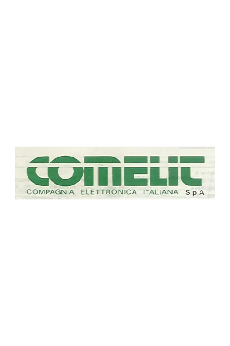
We move from a logo that lasted almost 20 years, built on the basis of Neuropol, a wide and futuristic font with clear references to the Bauhaus school, to a logo built with a custom font designed based on Gotham, considered one of the “freshest” of recent years, which draws inspiration from the geometries of Manhattan buildings and which in turn derives from the most famous Futura.
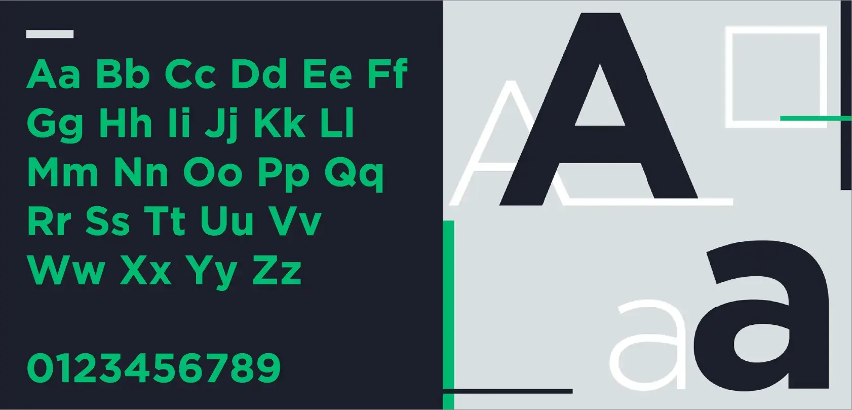
A strong and distinctive character.
A strong and distinctive character.
The use of uppercase and bold is preferred to emphasize the solidity, reliability, and presence of the company, with letters equidistant from each other to affirm equal proximity to every person connected to Comelit. In the design of the new logo, the two initial letters – the green “C” and the blue “O” – are constructed in such a way as to embrace each other almost to the point of merging (“With You“) in a perfect circle where the beginning and end coincide, in order to convey the perception of a sign that recalls the infinity symbol (“Always“).
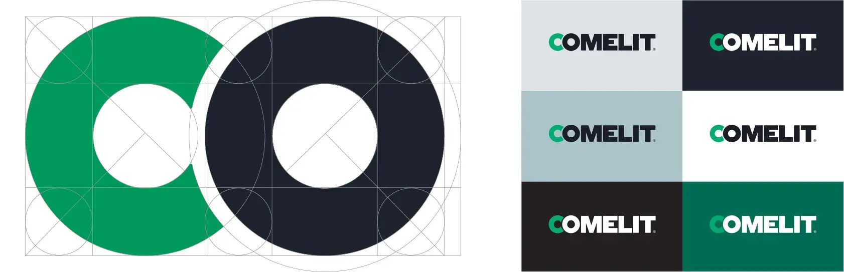
But that’s not all! There are also new colors, with a more evolved palette where two main colors stand out: a new green, Pantone 7480 C, brighter, more vibrant, the color of vitality and energy, paired with a very dark blue like Pantone 532 C, which not only recalls Comelit’s origins, but is also the color that symbolizes infinity, and here again the reference to ‘Always’. In addition to a new visual identity, we have also created a new “sonic brand” that shapes the emotional experience associated with our brand: a sound that is immediately recognizable, representing us and evoking a strong embrace that is hard to forget.
This is the company’s 5th logo change since its founding in ’56, and it is the most significant and marked departure from the past. It is a very deliberate and courageous choice, as every change of this magnitude is. We have a promise, which is the essence of our commitment, and we are ready to keep it, making it concrete with determination and courage, passion and responsibility: Comelit, With You Always.
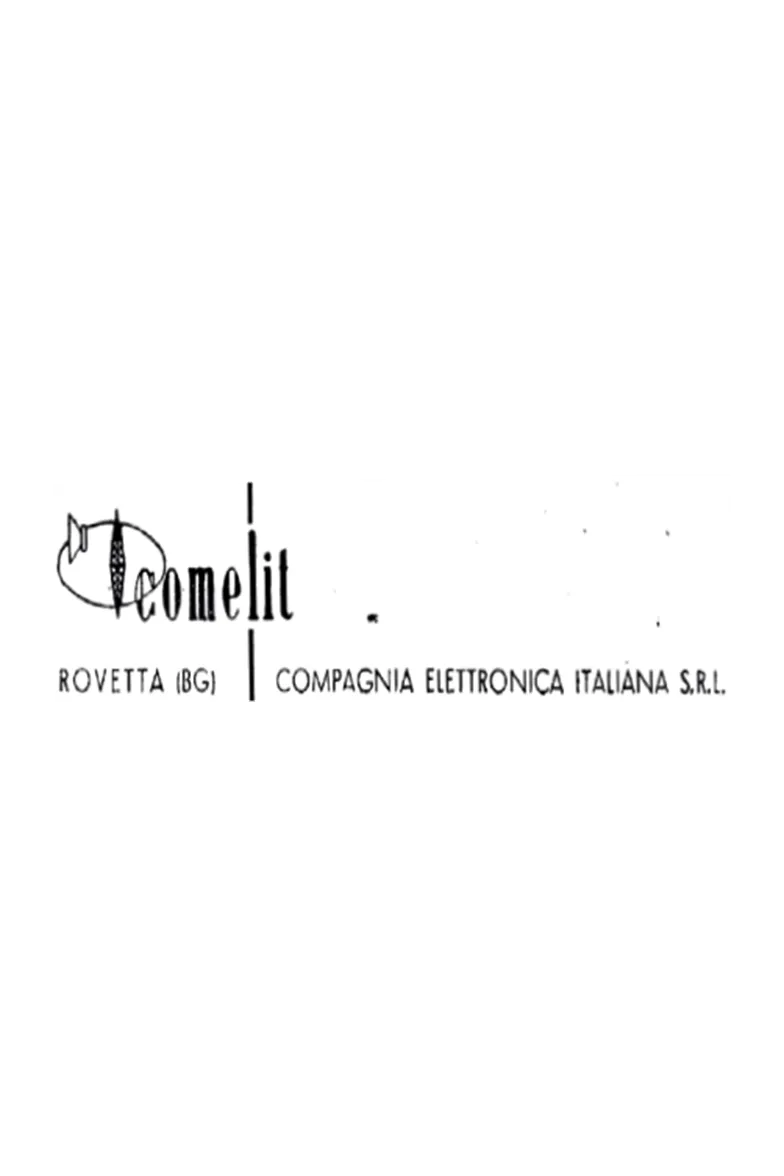
From past to future: the evolution of Comelit’s logo.
1956
1990
2016


1977
2010
PRESENT